
Customizing the Date & Time Component
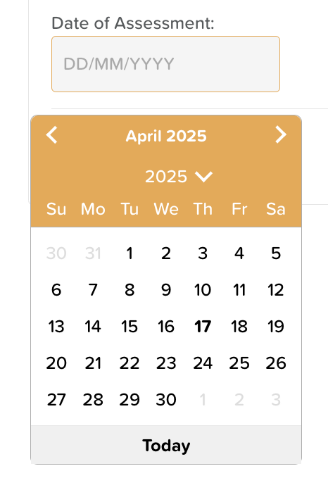
The Date & Time component allows users to easily select a date, time, or both within a form. It’s ideal for scheduling, tracking, or timestamping entries.
To configure this component:
1. Select the component, then click the settings wheel icon to open the Options panel on the right.
2. In the Options panel, you can customize the following settings:
Layout & Appearance
• Margins: Add spacing around the Date & Time field by specifying pixel values for the Top, Bottom, Left, and Right margins—especially useful when placing the component inside a table or compact layout.
• Font Size: Adjust the font size as needed. The default is 16px.
• Text Styling & Alignment: Apply bold, italics, underline, or strikethrough styles to your label text. You can also align the label to the left, center, right, or justify it.
Input Settings
• Input Type: Choose whether to display: Date and Time, Date Only, Time Only
• Required Field: Enable the “Is Required” checkbox if users must complete this field before submitting the form.
• Default Value: Select “Set default date & time to now” to automatically populate the current date and/or time when the form is opened.
• Disable Input: Check “Input Disabled” if you want to display the current date/time without allowing the user to modify it.
• Fit to Parent: Enable “Fit to Parent” to make the Date & Time field expand to fill the entire space of its container.
Need More Help?
If you need further assistance, you can reach out to our support team by emailing support@storii.com. Our support team is ready to help you with any questions or issues you may have.