
Text Input & Rich Text Components
Text Input vs Rich Text
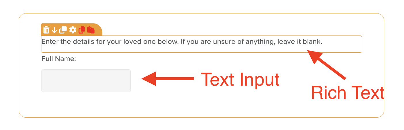
The Text Input component is best utilized when the goal is to allow users to input specific information directly into a text box. This component is ideal for scenarios where concise data entry is required, such as filling out names, addresses, or other straightforward responses.
On the other hand, the Rich Text component should be employed when the intention is to provide descriptive text. This includes elements such as headings, questions, or instructions.
Customizing the Text Input Component
The Text Input component allows users to enter free-text responses into a form field. It’s ideal for capturing names, notes, descriptions, and other custom entries.
To configure this component:
1. Click on the component to select it.
2. Click the settings wheel icon to open the Options panel on the right-hand side.
3. Review and adjust the following customization options:
Layout & Appearance
• Fit to Parent: Enable the “Fit to parent” option if you want the text input field to expand and fill the available space within its container.
• Margins: Add spacing around the text box by specifying pixel values for the Top, Bottom, Left, and Right margins. This is especially helpful when placing the component within tables or structured layouts.
• Font Size: Adjust the font size as needed. The default is set to 16px.
• Text Styles & Alignment: Customize the label with styling options such as bold, italic, underline, and strikethrough. You can also align the label to the left, center, right, or justify it.
Field Behavior
• Include in Analytics: Check the “Include in Analytics” box if you want the entered data to be captured in StoriiCare’s Analytics feature.
• Is Required: Enable the “Is required” option to ensure users must complete this field before submitting the form.
• Placeholder Text: Add placeholder text to provide guidance or examples to users. This text appears in the field in a light gray color and disappears when the user starts typing.
• Default Value: Pre-fill the field with a default value, which users can edit or replace as needed.
Customizing the Rich Text Component
The Rich Text component allows you to add formatted text, media, and visual elements to your form. This is useful for providing context, instructions, or additional information within your form layout.
To configure the Rich Text component:
1. Click on the component to select it.
2. Click the settings wheel icon to open the Options panel on the right-hand side.
3. Consider the following customization options:
Layout & Appearance
• Margins: Add padding around your Rich Text block by entering pixel values for the Top, Bottom, Left, and Right margins.
• Font Size: Adjust the font size as needed. The default is set to 16px.
• Text Styles & Alignment: Apply bold, italic, underline, or strikethrough text formatting. Choose the alignment of your text—left, center, right, or justified.
Content Export
• Include in CSV: Enable the “Include in CSV” option if you would like the Rich Text data to be included when exporting completed forms as a CSV file.
Additional Formatting Options (Available in the top toolbar)
You can enhance your Rich Text content using the built-in formatting toolbar. This includes:
• Hyperlinks – Link to external websites or resources.
• Block Quotes – Highlight important text or quotations.
• Text Colors – Make text red or blue for emphasis.
• Bullet & Numbered Lists – Organize content clearly.
• Media Uploads – Insert images, video files, audio files, or document files.
Need More Help?
If you need further assistance, you can reach out to our support team by emailing support@storii.com. Our support team is ready to help you with any questions or issues you may have.