Form Builder
What is Form Builder?
Form Builder enables users to create and customize their own forms on StoriiCare.
How do I create a form?
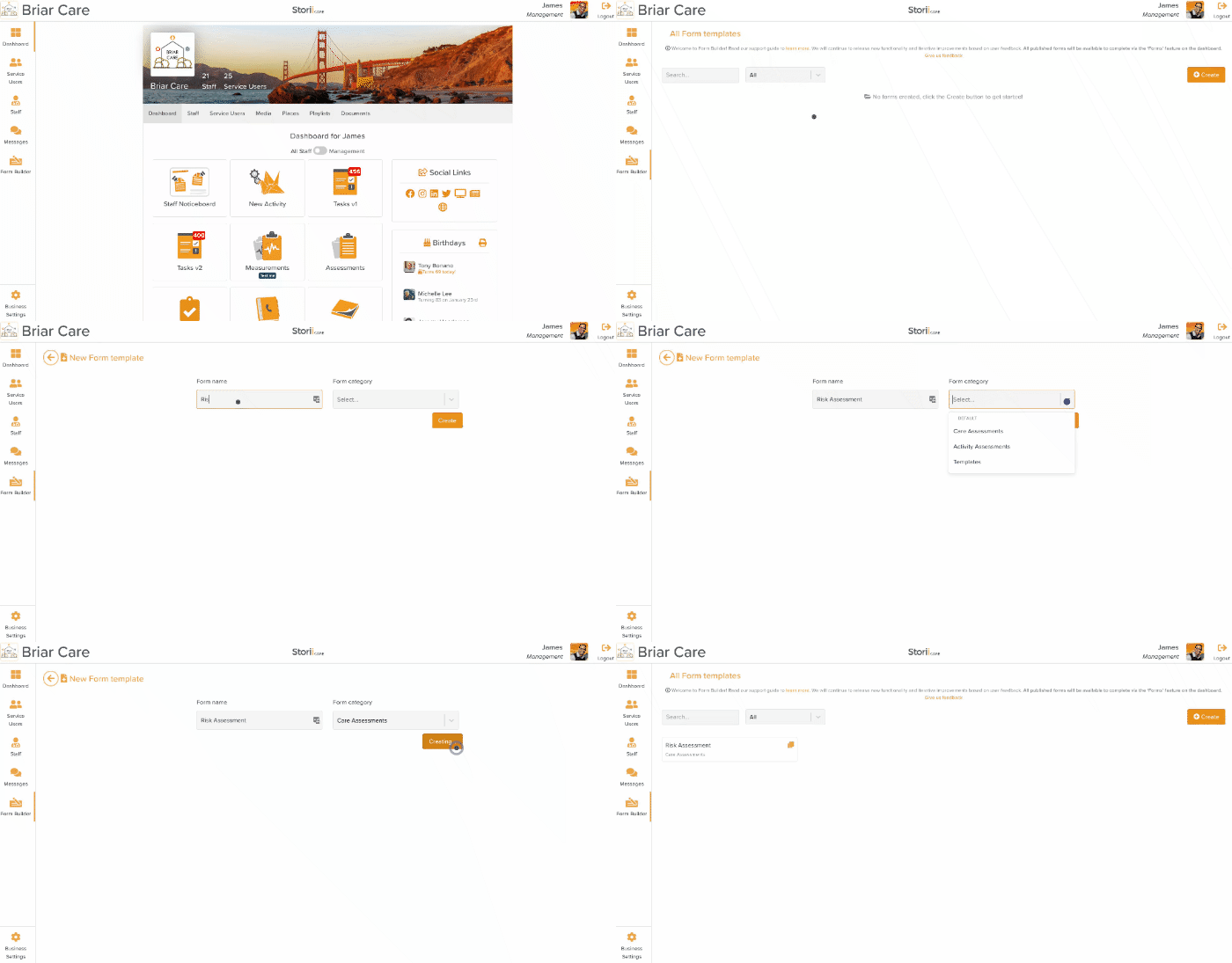
Forms can be created and edited via a new 'Form Builder' icon, located on the left side panel of StoriiCare. Please note that the form builder view is only accessible on Desktop devices. We recommend using the Google Chrome browser for the best form builder experience. Once a form is created and published, it can be completed on any device, including smartphones, via the new 'Forms' feature located on the Dashboard.
Creating a Form Template
How can staff access the forms I create?
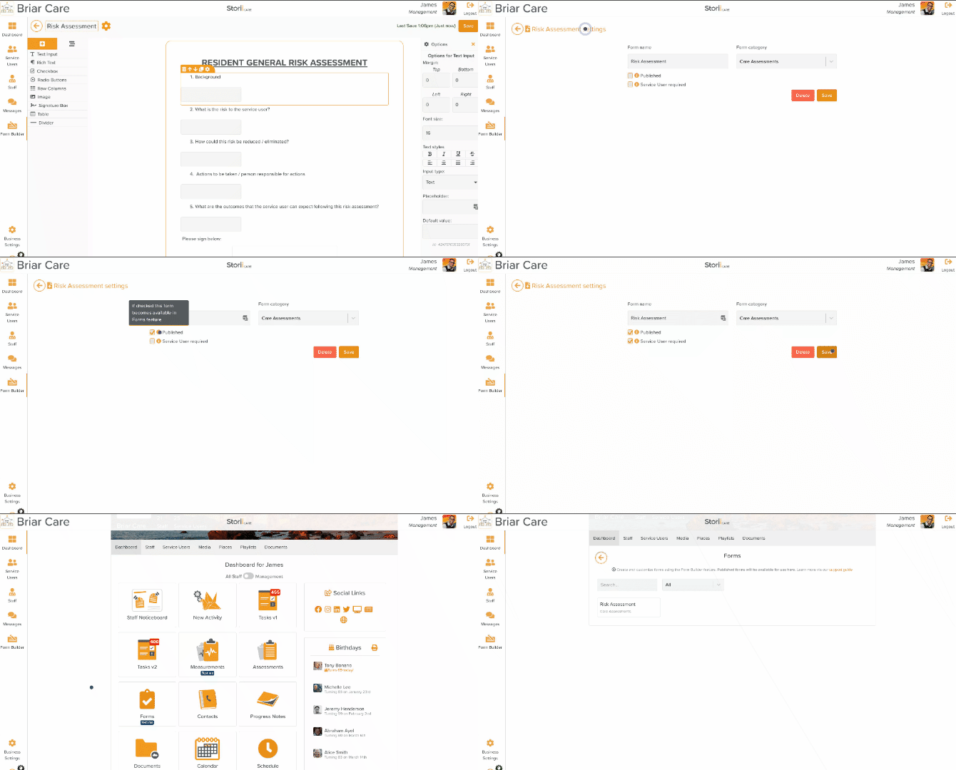
Forms that are created in the builder become available for staff to complete once they are set to 'Published' within the settings of a Form. Staff will then see this as an available form for completion within the new 'Forms' feature accessible from the Dashboard. You also have the option here to require a Service User to be select prior to completing the form.
Accessing Forms
Where are forms saved once completed?
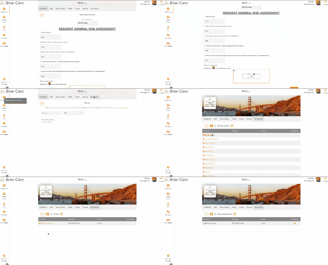
Once a form has been successfully submitted via the 'Forms' feature, it will automatically be stored within the Document store as a PDF. If a service user is selected when completing a form, it will be stored within that Service User's document store within a new 'Form' folder. If a form is completed unrelated to any service user or for a service user that is not yet been created on StoriiCare, it will be stored within the Document store for the Business under 'Forms'.
Completed forms save location
How to use Form Builder components when creating a form
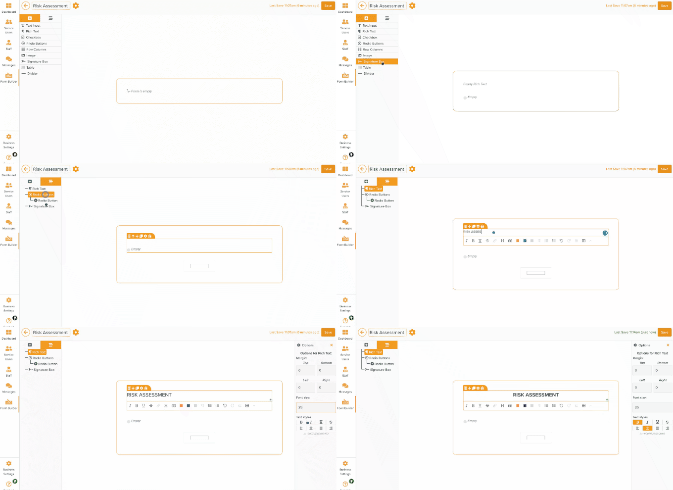
Form components can be added to the form canvas using the 'drag and drop' method. Select the component you require such as 'Radio Buttons' or 'Text Input', and drag it onto the canvas. From there, you can directly enter text, change the order the element appears, duplicate the element or additional changes via the 'Cog' icon. Selecting the cog icon for each element will open the Options panel to the right of the Form Builder interface. This provides additional formatting controls such as adding Placeholder text, adjusting the font size, or adding margins to a form. Components can be selected either by directly clicking the corresponding canvas area or by selecting the 'Form Components Structure' tab on the top left of the page next to the plus icon. All components, including nested components, will be displayed in an easy to view and select structure. This can be very useful for complex forms.
Drag and Drop Elements
Form Builder Shortcuts
Experienced users of StoriiCare may prefer to use keyboard shortcuts. Form builder keyboard shortcuts are as follows:
Ctrl + S - Saves form
Ctrl + D - Duplicates selected component
Ctrl + Delete - Deletes selected component, a confirmation modal will appear
Escape - Deselects component and hides the right Options menu
Shift + Enter (while in a rich text box) - Creates a new line without a double space
Duplicating a Form Template
Templates can be duplicated by selecting the Orange duplicate squares icon within the template area. (highlighted below)
Deleting a Form Template
To delete a form template, select the form template you want to remove, and head to the Orange Cog icon next to the name within the form. You will find an option within here to delete the form.
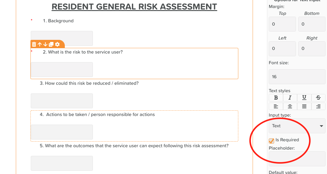
Required fields: To ensure certain form components are filled when completing a form, you can now mark a component as a required field in the form builder. To do this, access the settings of a component, and ensure the 'Is Required' area is checked.
Required Fields: Ensure 'Is Required' is checked
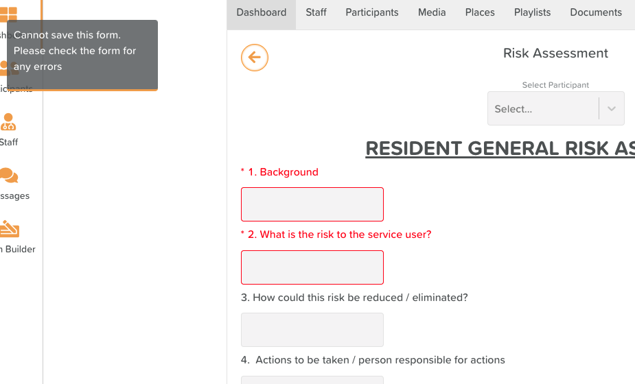
When completing a form, individuals will be alerted to the areas that must be completed by a red asterix, and if they try to save with these areas empty, they will be highlighted and a notification will appear asking them to review the form for errors.
Required fields must be filled to complete a form
Form Drafts: Another highly requested feature, forms created using the form builder can now be set to allow drafts. This enables staff to pause their work on a form and come back to it later, or complete part of a form, leaving the remainder for another staff member to complete and submit.
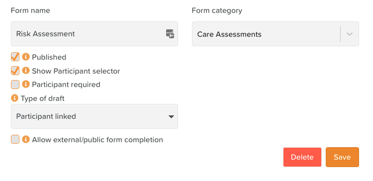
To enable drafts on a form, head to the settings of that form within the form builder, and change 'Type of draft' from None to one of the available options. For most forms, we recommend using 'Participant linked' which will link a draft to a participant, allowing other staff members to access the draft if required by selecting that participant when completing a form.
Form Settings - Select a 'Type of draft'
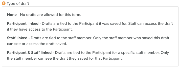
Below is an explanation of the other draft options.
Explanation of draft types
To save a form as a draft, simply select the 'Save draft' button to the left of the 'Submit' button at the bottom of a form that has drafts enabled.
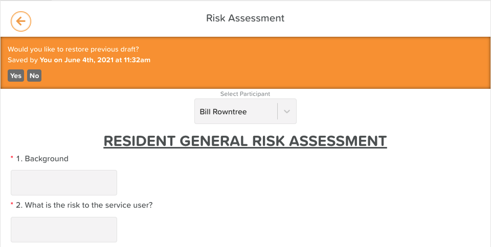
Upon opening a form that has drafts enabled and a draft saved, you may see the option to 'restore a previous draft.' Selecting 'Yes' will pull the draft data that was saved, allowing you to continue adding to or submitting that form.
Restore previous draft
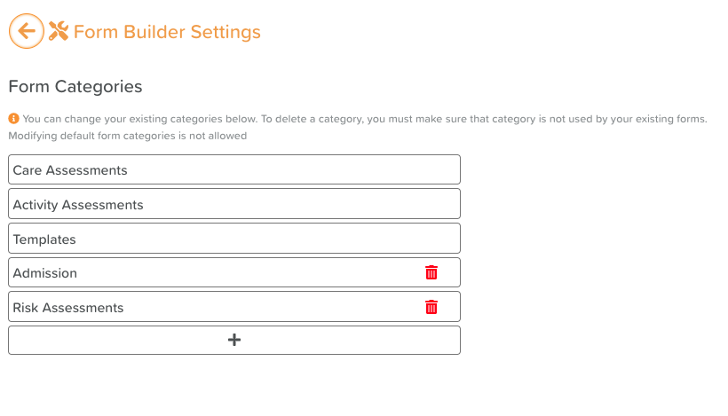
Custom Form Categories: You are now able to create and customize Form Categories. Click the settings cog next to the category dropdown on Form Builder to access Form Builder Settings. From here, you will be able to add, customize and remove your own categories. These categories can then be applied to new or existing forms.
Custom Form Categories
Date & Time Component
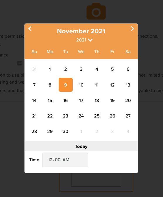
The Date & Time component adds a date and time picker to any form for quick date or time selection. You can customise the picker by selecting the settings cog for the component after it has been dragged onto the Form Builder canvas. Under 'Input type' you are able to choose between 'Show date and time', 'Show date only' and 'Show time only'. You also have the option to set the default value to 'now' so that when a form is getting completed, the current date and/or time will be pre-filled automatically.
Date & Time Component
Dropdown Component
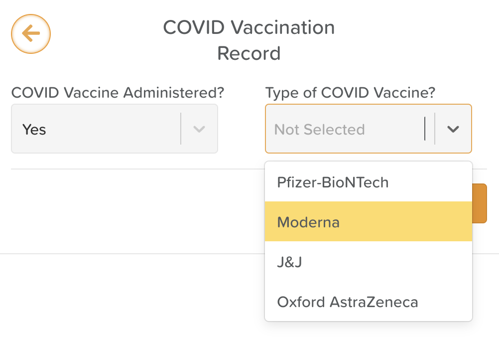
The dropdown component can be used to create single or multi-select dropdowns within any StoriiCare form. Dropdowns are a powerful tool which can be used to quickly access and select from a list without the difficulties of displaying a full list within a form at all times. They are also a great replacement for any radio button or checkbox components that don't work well with larger datasets.
Form Builder Dropdowns
To select what kind of data is accessible via the dropdown component, select the component settings cog within the form builder canvas.
From settings, you will be able to:
Select if the dropdown is a single select or multi-select dropdown
Choose a dropdown list to display
Assign a default displayed value or values from your chosen dropdown list
Enable 'Fit to parent' to have the dropdown span the full component width
The dropdown component accesses dropdown data from our "Lists" feature, which we discuss below.
Group Component
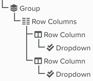
The group component can be used to organise multiple components together under one 'component' that can easily be duplicated. This is useful for complex forms with repeating elements, or areas in which you might wish to change the font or formatting for multiple components at once.
Items within a Group in a StoriiCare Form
Matrix Calculator
In one of our biggest updates yet, today we have released Matrix Calculations and new Score Badges to the StoriiCare Form Builder.
Clients are now able to create any custom score for a form or assessment on StoriiCare, with generated responses based on a calculated point score. This is particularly beneficial for the creation of screeners, intakes and risk assessments. At StoriiCare, we've seen the complexity of assessments that are often ever-changing, from state to state and country to country. We decided to put the power in our clients hands to change forms and calculations whenever suits them. We hope that this will encourage new, progressive ways of running care assessments and enable care teams to experiment with new processes whenever and wherever it suits them.
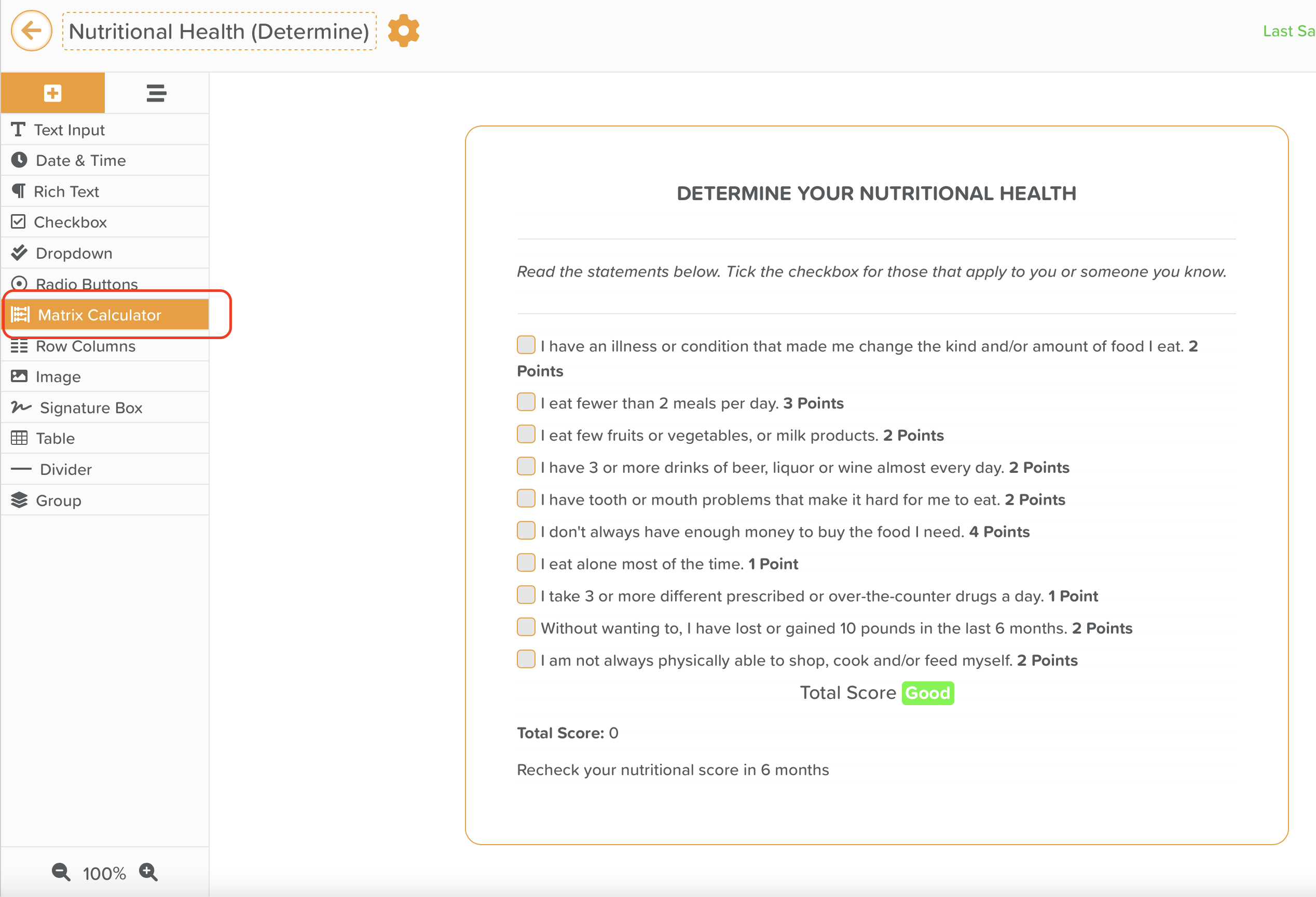
To get started, within the form builder feature simply drag the new 'Matrix Calculator' component into any form canvas, even to any pre-existing forms you may already have generated and are currently using. At current, scores can be generated either from radio buttons or checkboxes. Once the Matrix Calculator is within the canvas, you will see point values displayed for connected check boxes or radio buttons. (If you do not want a radio button section or checkbox to be included in the calculation, you can select 'Disable Matrix Calculator' in the settings cog for that specific component).
Form Builder Matrix Calculator
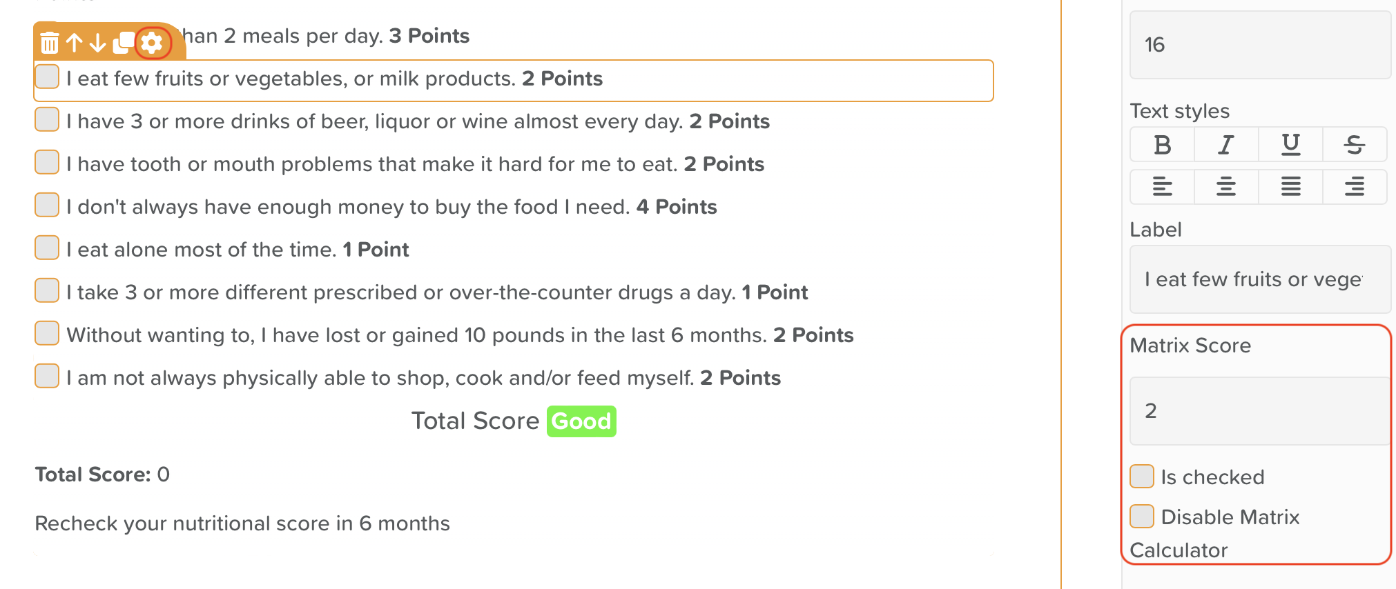
To assign or change a point value, simply click the settings cog for a specific component and edit the value in the 'Matrix Score' field.
Edit Component Matrix Score Point Value
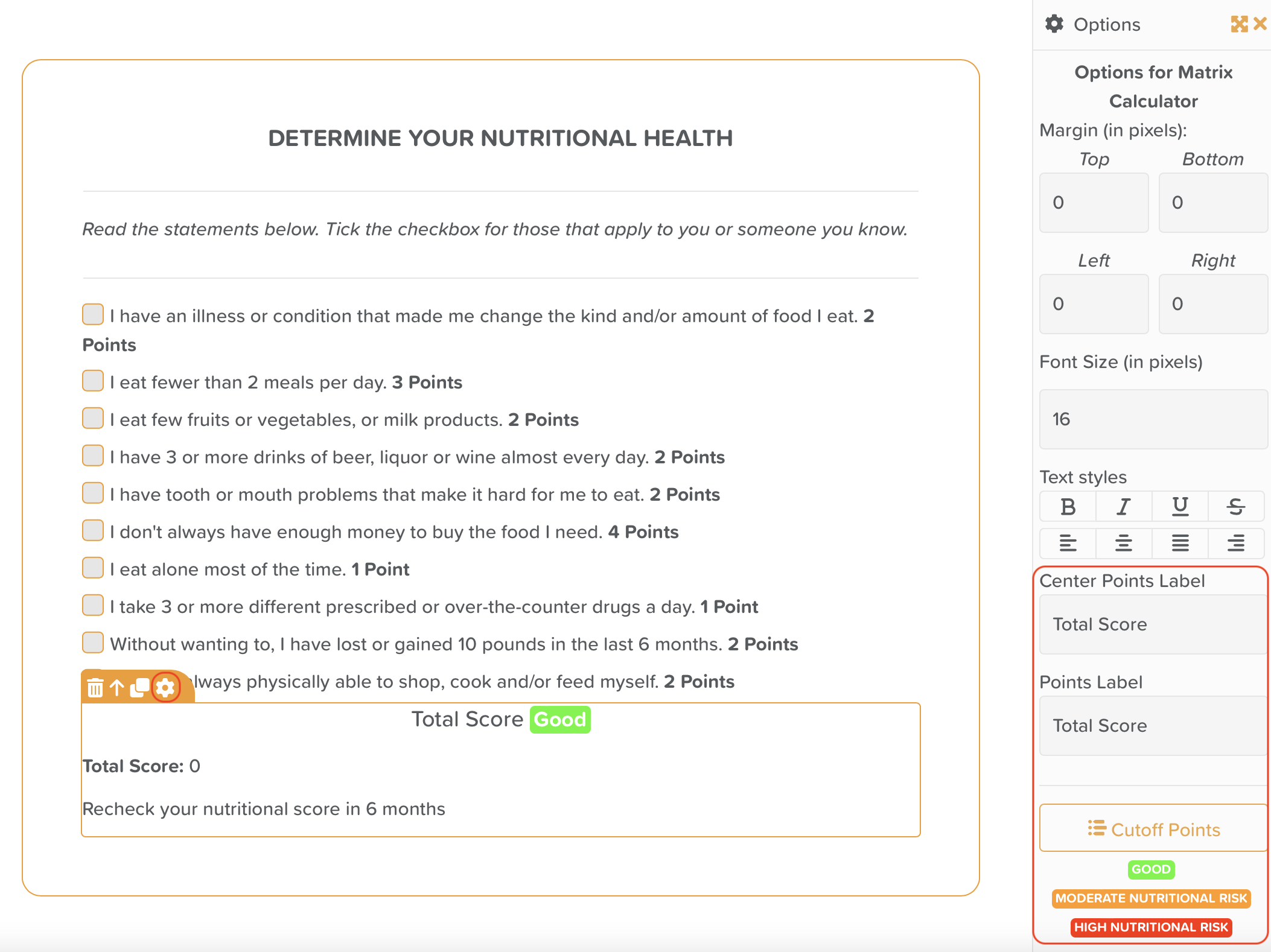
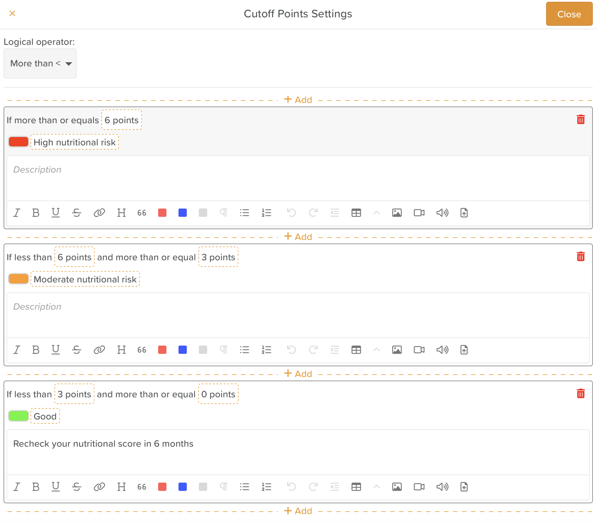
To set rules for Matrix Calculations, click on the settings cog of the Matrix Calculator component. From settings you will be able to customize the terminology used for scores e.g. 'Total Score' or 'Final Score'. You will also able to access a button named 'Cutoff Points'. The 'Cutoff Points' area enables you to set parameters for badges and set descriptions to appear relative to a generated score.
Matrix Calculator Settings
Within the Cutoff Points area you will be able set a logical operator (More than, Less than) that will apply to the calculation of points. Custom badge definitions and a badge colour can be set, alongside a custom description that will be displayed alongside the badge whilst an assessment is being completed. Descriptions utilize our rich text box, enabling text formatting, images, videos, YouTube embeds and more within any calculated response. If a form is submitted for a Service User and a badge is generated relative to points calculated, the badge will also automatically display within the Face Sheet / Overview for that Service User.
Cutoff Points
Form Images Markup (Allow Drawing)
You are now able to draw on any images added to a form on the Form Builder. Key uses cases include:
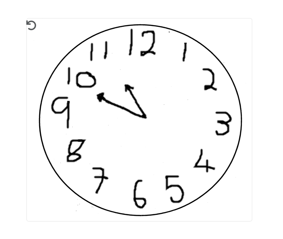
Any assessment that requires a client to draw e.g. A SLUMS assessment
Body map forms
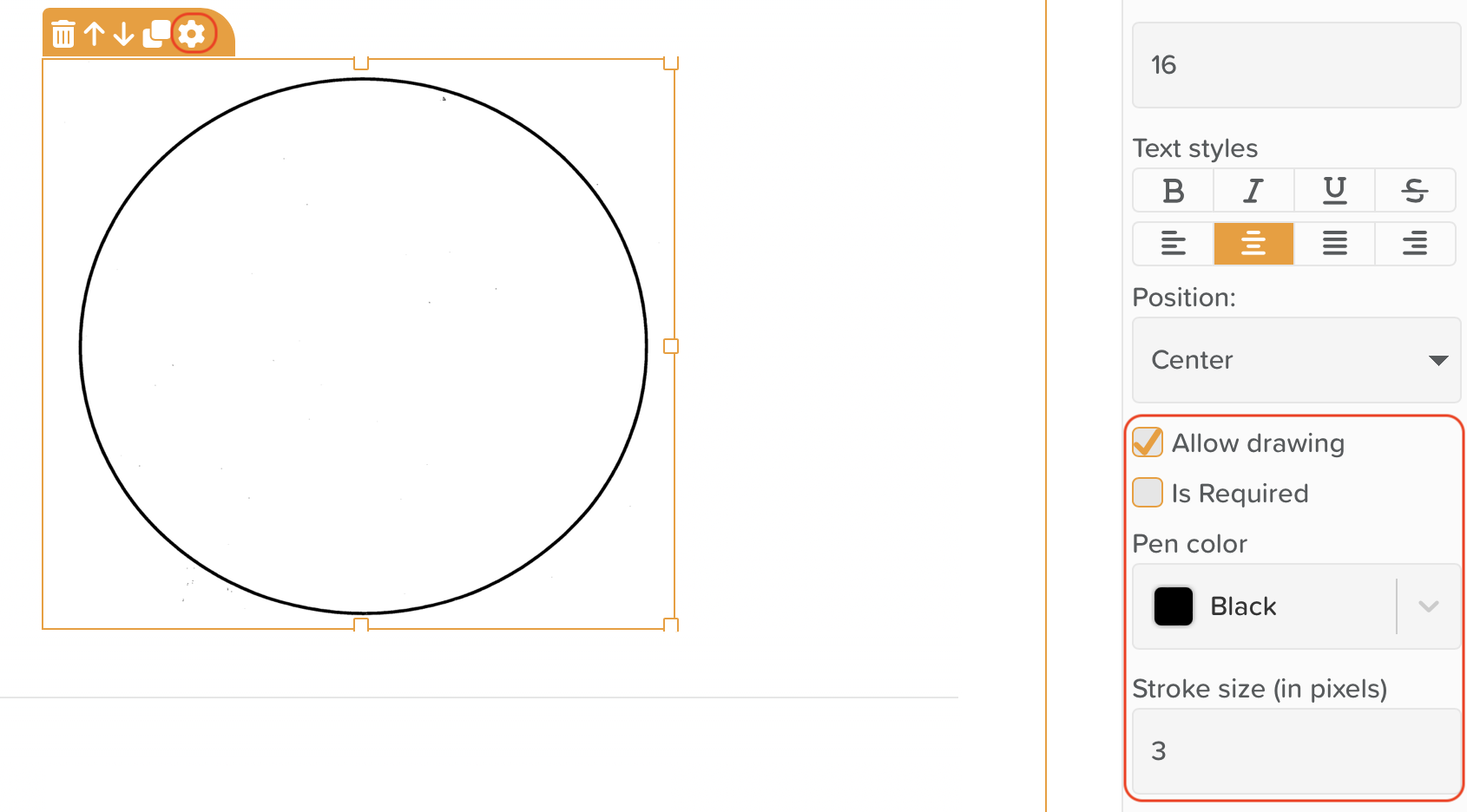
Form Images Markup (Allow Drawing)
In order to enable drawing on an image, simply access the settings cog for any image that exists within or is uploaded to a form. Check 'Allow drawing'. You will also have the options to choose whether a drawing is required prior to submitted a complete form, the color of the pen shown on the image and the pixel size of the pen stroke. We are excited to see how clients use this new feature!
Form Digital Markup Example - Clock Face in SLUMS Assessment
Coming soon to Form Builder
Ability to pre-populate form elements with data
Ability to populate areas across StoriiCare from form elements
Open source forms
Form Analytics
Additional elements
Much more!

